
In my residency at MIS (The São Paulo Museum of Image and Sound) I am developing an independent audiovisual work based on my Glitch Studies Manifesto. The video is going to be called Order and Progress (as is the motto written on the flag of Brazil).
In the original Glitch Studies Manifesto I argue for research and a broader understanding and acceptance of glitches in 11 pages of text. Because of this big amount of text I am sure I wont be able to avoid text in this video, so over the past weeks I have been experimenting and puzzling on how to tackle the issue of text without it being disturbing...
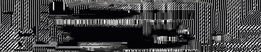
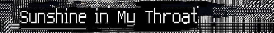
I made two true type fonts: One called Glitch that is based on gif glitching and one based on compression called Artifact. They are available to download and install - so you can use them in your own computer. In the original Glitch Studies Manifesto I argue for research and a broader understanding and acceptance of glitches in 11 pages of text. Because of this big amount of text I am sure I wont be able to avoid text in this video, so over the past weeks I have been experimenting and puzzling on how to tackle the issue of text without it being disturbing...
I am not sure about the glitch font, I like the lofi font but I think I wont use it in Order and Progress - at least not in the "normal" state. --- they are still so clean..
2 comments:
Nice fonts! I'm defo more of a fan of the "Glitch" font
hey I came across your blog, I do somethign similar - or DID. http://vimeo.com/13338234 with DVD glitches
Post a Comment