OLA, Saludar desde Mexico!
It has been a while since I blogged and I am quite behind on posting the projects I have been working on (or emails, or anything else really - I am sorry its all the work that keeps me busy!)...
The Backlogs include a review of Transmediale, a new video, some very nice publications and some other more or less important stuff. I hope the coming weeks I will get better at ...answering emails, finishing posts and all that. ..... >>>
I am in Mexico now, for two months in which I will have my EMARE residency at CANTE, Cante is an art institute in San Luis Potosi, in the middle of the mexican desert. The building I am working in is a former prison - Its architecture follows the design of a perfect panopticon. Its quite big, and has gardens between the different cell blocks that are all dedicated to different art practices.
Its beautiful!
A lot of things about Mexico feel very surreal -- the colors, the art, the traditions and how the people look (there are a lot of very pronounced faces).
Sometimes I feel like it all ____ it all stretches my brain.
Sometimes I feel like it all ____ it all stretches my brain.
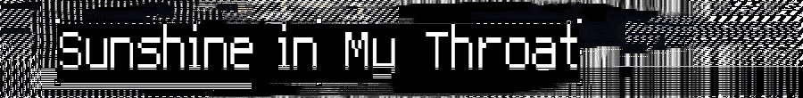
Anyway. I guess most of all that I have been writing here is actually for one reason only - to show this new font (which you can see when you use safari or Chrome)- I guess you wont even really read the post because its quite unreadable, though I think its nice to look at.
During my visit of Mexico City I have seen a lot of very beautiful fonts on salient buildings that remind me of Art Nouveau. Yet every time they possess something peculiarly Mexican too.
Charles Rennie - Mexicanized _.:;dotty;:._ lofi.
2 comments:
Download does not work.
Fix it plz?
Woooepssiie, my fault - fixed now! Thanks for letting me know!
Post a Comment